안녕하세요 이번에 작성하게 될 내용은 제가 react-native에서 채팅방 목록을 어떤 식으로 구현했는지 글을 작성했습니다.
💻 개발 환경
React-native(expo) + TypeScript로 진행되었습니다.
🧐 구현하게 된 계기
현재 진행 중인 토이프로젝트에서 채팅 기능이 필요했습니다.
그 이유는 당근마켓을 벤치마킹한 서비스를 만들고 있기 때문에 사용자들끼리의 소통은 필수였기에 채팅 기능은 선택이 아닌 필수였습니다.
처음에 채팅에 대한 기획 + 아이디어 회의를 진행할 때 제가 제시했던 의견은
사용자에게 가장 친숙한 UI, UX는 카카오톡이기에 채팅을 만들 때 카카오톡처럼 만든다면 잘 만든 것이라는 의견을 제시했습니다.
(사실 이 말은 전에 다니던 회사 팀장님이 회사 내에 채팅을 구현할 때 이런 생각을 가지고 만드셨다고 해주셨던 말씀이었습니다)
그 의견에 디자이너 분과 기획자 분도 동의를 하셨기에 카카오톡과 유사한 UI, UX를 가진 디자인이 나온 게 아닐까 싶습니다.
이런 일을 계기로 채팅방 목록 개발을 진행하게 되었습니다.
🤔 기능 산출 및 개발 계획
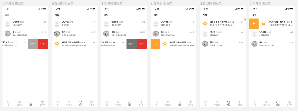
일단 첫 번째로 진행해야 하는 일은 당연히 케이스 정리입니다.
피그마를 보며 케이스를 정리해 봤습니다.
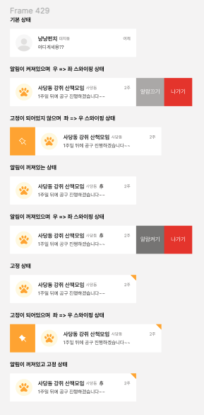
이런 식으로 가능한 모든 케이스를 정리를 해봤습니다.
기본 상태에서 변화를 주게 되는 케이스는 핀셋 여부, 알림 여부입니다.
그런데 여기서 문제가 발생했습니다. 저 스와이핑을 어떤 식으로 구현을 할지 감이 안 잡혔습니다.
머릿속에 방법을 떠올리기 위해 고민을 해봤습니다.
제가 생각했던 방법은 Carousel 형태로 개발을 하여 가운데를 채팅방 콘텐츠로 채우고 좌, 우로 스와이핑이 가능하도록 하는 거였습니다.
저보다 좋은 의견은 얼마든지 나올 수 있고 제 생각에 만족이 되지 않아서
조금 더 고민을 진행하다가 뤼튼에게 힘을 빌려보기로 했습니다.
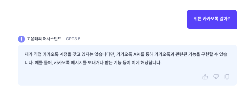
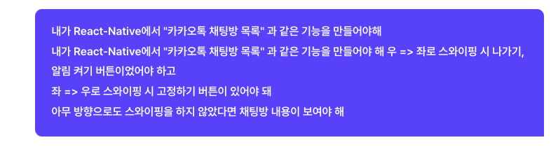
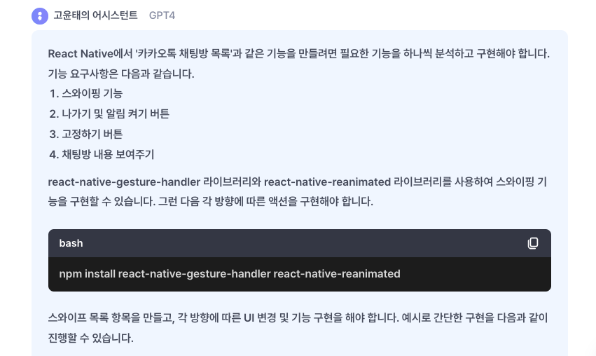
뤼튼 덕에 아주 중요한 키워드에 한 걸음 접근했습니다.
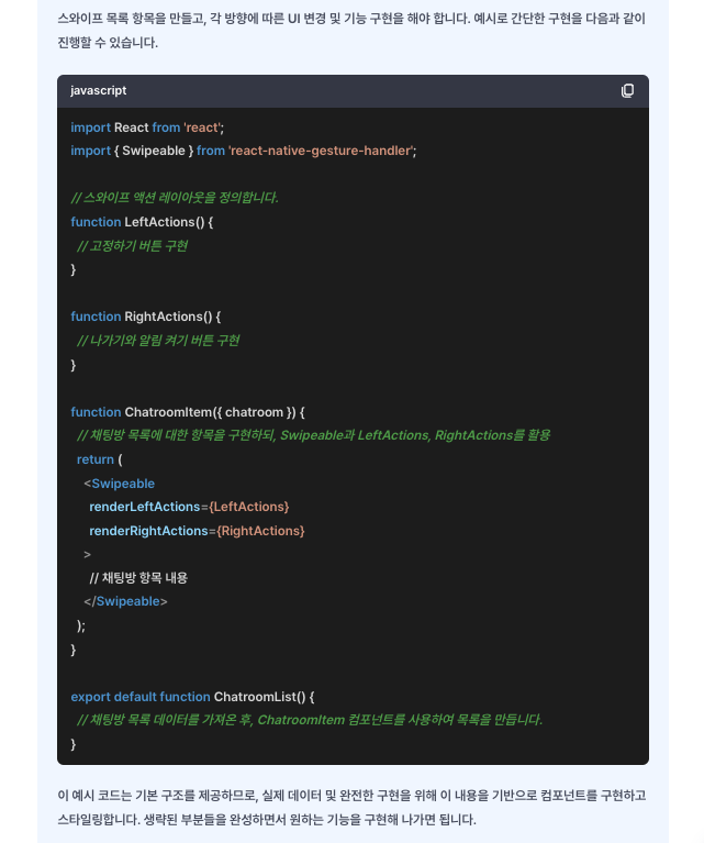
import { Swipeable } from 'react-native-gesture-handler';
Swipeable를 사용하는 것입니다.
한 번도 사용해 본 적이 없기에 바로 공식 문서에 들어가서 가볍게 쓰윽 읽어봤습니다.
https://docs.swmansion.com/react-native-gesture-handler/docs/api/components/swipeable
Swipeable | React Native Gesture Handler
This component allows for implementing swipeable rows or similar interaction. It renders its children within a panable container allows for horizontal swiping left and right. While swiping one of two "action" containers can be shown depends on whether user
docs.swmansion.com
사용법을 간단하게 확인하고 개발에 들어갔습니다.
👀 컴포넌트 개발(CODE)
import React from 'react';
import { View, Text, Image, Pressable } from 'react-native';
import { Swipeable } from 'react-native-gesture-handler';
import Color from '../../constants/color';
import TYPOS from './typo';
import Pin24 from './icons/Pin24';
import FillPin24 from './icons/FillPin24';
import Bell16 from './icons/Bell16';
import PinIndicator from './icons/PinIndicator';

interface Props {
  image: string;
  roomName: string;
  region: string;
  timeStamp: string;
  content: string;
  isPinned?: boolean;
  isNotificationEnabled?: boolean;
  onPinPressHandler?: () => void;
  onExitPressHandler?: () => void;
  onToggleNotificationHandler?: () => void;
}

const ChatRoomItem = ({
  image,
  roomName,
  region,
  timeStamp,
  content,
  isPinned,
  isNotificationEnabled,
  onPinPressHandler,
  onExitPressHandler,
  onToggleNotificationHandler,
}: Props) => {
  const renderLeftActions = () => {
    return (
      <View
        style={{
          flexDirection: 'row',
          alignItems: 'center',
        }}
      >
        <Pressable
          style={{
            backgroundColor: Color.primary700,
            width: 72,
            height: '100%',
            alignItems: 'center',
            justifyContent: 'center',
          }}
          onPress={onPinPressHandler}
        >
          {isPinned ? (
            <FillPin24 color={Color.white} />
          ) : (
            <Pin24 color={Color.white} />
          )}
        </Pressable>
      </View>
    );
  };

  const renderRightActions = () => {
    return (
      <View
        style={{
          flexDirection: 'row',
          alignItems: 'center',
        }}
      >
        <Pressable
          style={{
            backgroundColor: isNotificationEnabled
              ? Color.neutral3
              : Color.neutral2,
            width: 80,
            height: '100%',
            alignItems: 'center',
            justifyContent: 'center',
          }}
          onPress={onToggleNotificationHandler}
        >
          <Text style={[{ color: Color.white }, TYPOS.body1]}>{`알림 ${
            isNotificationEnabled ? '끄기' : '켜기'
          }`}</Text>
        </Pressable>
        <Pressable
          style={{
            backgroundColor: Color.error,
            width: 80,
            height: '100%',
            alignItems: 'center',
            justifyContent: 'center',
          }}
          onPress={onExitPressHandler}
        >
          <Text style={[{ color: Color.white }, TYPOS.body1]}>나가기</Text>
        </Pressable>
      </View>
    );
  };

  return (
    <Swipeable
      renderRightActions={renderRightActions}
      renderLeftActions={renderLeftActions}
      friction={1.5}
    >
      <View
        style={{
          backgroundColor: Color.white,
          padding: 16,
          flexDirection: 'row',
          position: 'relative',
        }}
      >
        {isPinned && (
          <PinIndicator
            color={Color.primary700}
            style={{
              position: 'absolute',
              top: 0,
              right: 0,
            }}
          />
        )}
        <Image
          style={[
            {
              width: 48,
              height: 48,
              resizeMode: 'cover',
              borderRadius: 48,
              marginRight: 16,
            },
          ]}
          source={{
            uri: image,
          }}
        />
        <View style={{ flex: 1 }}>
          <View
            style={{
              flexDirection: 'row',
              alignItems: 'center',
              flex: 1,
              justifyContent: 'space-between',
            }}
          >
            <View style={{ flexDirection: 'row', alignItems: 'center' }}>
              <Text style={[{ color: Color.black }, TYPOS.headline4]}>
                {roomName}
              </Text>
              <Text
                style={[
                  { color: Color.neutral2, marginHorizontal: 4 },
                  TYPOS.body3,
                ]}
              >
                {region}
              </Text>
              {!isNotificationEnabled && <Bell16 color={Color.neutral2} />}
            </View>
            <Text style={[{ color: Color.neutral2 }, TYPOS.body3]}>
              {timeStamp}
            </Text>
          </View>
          <View>
            <Text style={[{ color: Color.neutral1 }, TYPOS.body2]}>
              {content}
            </Text>
          </View>
        </View>
      </View>
    </Swipeable>
  );
};

export default ChatRoomItem;
코드 설명
현재 코드에는 ChatRoomItem을 Press 시 채팅방 상세로 이동하는 코드는 생략이 되어 있습니다.
각각의 Props는
| image | 채팅방 대표 이미지의 URL |
| roomName | 채팅방 이름 |
| region | 채팅방 지역 정보 |
| timeStamp | 채팅방 최근 메시지 전송 시간 |
| content | 채팅방 최근 메시지 내용 |
| isPinned | 현재 채팅방이 고정된 상태인지 여부 (기본값: false) |
| isNotificationEnabled | 현재 채팅방의 알림 사용 여부 (기본값: false) |
| onPinPressHandler | 채팅방 고정 버튼 클릭 시 호출될 콜백 함수 |
| onExitPressHandler | 채팅방 나가기 버튼 클릭 시 호출될 콜백 함수 |
| onToggleNotificationHandler | 채팅방 알림 사용 여부 토글 시 호출될 콜백 함수 |
isPinned를 통해 '좌'에서 '우'로 스와이핑 시 Pin의 아이콘 여부를 결정하고 오른쪽 끝에 표시 여부를 결정하도록 했습니다.
isNotificationEnabled를 통해 '우'에서 '좌'로 스와이핑 시 알림 켜기/끄기 여부와 Background Color의 여부를 결정했습니다.
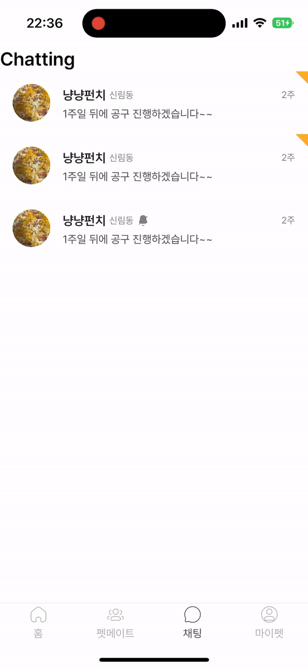
✨ 완성된 ChatRoomItem
이렇게 끝이 났다 생각하여 혹시 디자이너님의 의도와 맞는지 단톡방에 영상을 올려봤습니다.
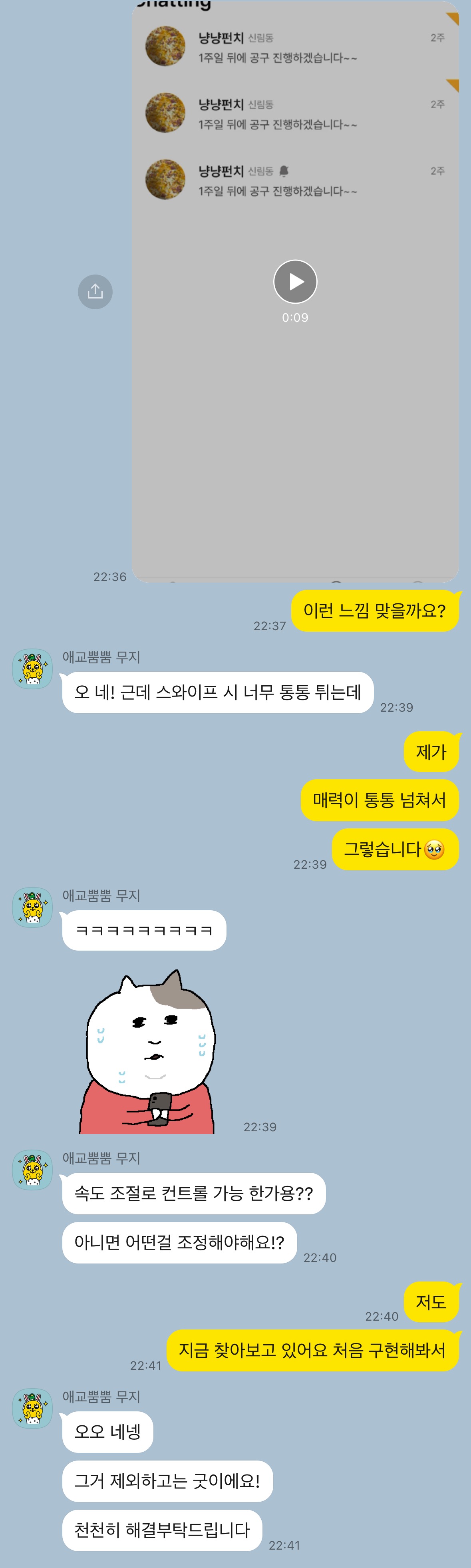
너무 통통(?) 튄다는 피드백을 받았고
저도 보다 보니 느껴져서 피드백을 반영하기 위해 공식 문서를 다시 읽기 시작했습니다.
😩 수정 작업
공식 문서를 찾아보던 중
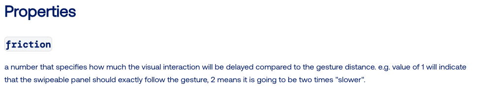
이런 속성을 발견했습니다.
번역기를 돌려보면
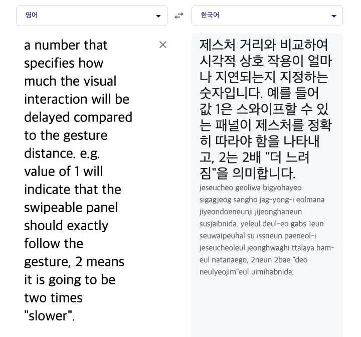
이러한 결과를 얻을 수 있었고 실제로 값을 변경해 보고 비교해 봤습니다.
기존 코드
   <Swipeable
      renderRightActions={renderRightActions}
      renderLeftActions={renderLeftActions}
    >
기존 거는 아까 위에서 보신 거처럼 통통(?) 튀는 것을 확인할 수 있습니다.
변경한 코드
    <Swipeable
      renderRightActions={renderRightActions}
      renderLeftActions={renderLeftActions}
      friction={10}
    >
변경한 코드에서는 통통(?) 튀는 것이 사라지고 손가락을 교차하면서 당겨야 할 정도로 뻑뻑(?) 해졌습니다.
이 값을 디자이너 분이 원하시는 느낌에 맞춰 만족하는 값으로 변경하여 개발을 완료했습니다.
😁 글 작성 후기
카카오톡의 채팅방 목록 UI, UX는 제가 모바일 앱 중에 가장 많이 접한 UI, UX였는데 제가 이렇게 직접 개발해 보니 카카오톡의 기획 의도를 개발하면서 찾아가는 과정이 재미있었던 거 같습니다.
또 이번 개발 덕분에 react-native-gesture-handler라는 것도 처음 접하게 된 기회이기도 하고요
사실 react-native-gesture-handler 이거 같은 경우 개발을 진행하다 보면 import를 시도할 때

이런 식으로 뜨지만 직접 사용해 보거나 공부할 일이 없었는 데 사용해 볼 수 있게 된 좋은 기회였습니다.
'개발' 카테고리의 다른 글
| React Native RadioButton 구현하기 (4) | 2023.09.01 |
|---|---|
| React Native useOverlay를 만들어 리팩토링 하기 이 글은 진짜 떠야 해 (0) | 2023.08.22 |
| React Native ToastMessage 구현하기 (1) | 2023.07.27 |
| React Native Dropdown 구현하기 (1) | 2023.07.18 |
| Expo 갤러리와 카메라 구현하기 (0) | 2023.07.04 |