안녕하세요 이번에 작성하게 될 내용은 제가 react-native에서 RadioButton을 구현한 방법에 대해 글을 작성해 보겠습니다.
💻 개발 환경
React-native(expo) + TypeScript로 진행되었습니다.
🧐 구현하게 된 계기
진행하고 있는 토이 프로젝트에서 디자인 시스템에 RadioButton이 존재하고 있습니다.

이런 식으로 말이죠 사실 개발은 예전에 진행하고 이미 사용 중에 있습니다만
최근에 블로그 관리(?)를 통해 확인해 보니 제 블로그 글 중에 항상 매주 1위를 하고 있는 글이 있습니다.
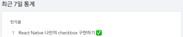
바로 React Native에서 라이브러리를 사용하지 않고 checkbox를 구현하는 법을 작성한 글입니다.
React Native 나만의 checkbox 구현하기 ✅
안녕하세요 이번에 작성하게 될 내용은 제가 react-native에서 저만의 checkbox를 어떤 계기로 구현하게 되었고 어떤 식으로 구현했는지에 대해 전달을 하고자 작성해 봅니다 개발 환경 React-native(expo)
yun-tech-diary.tistory.com
왜 과연 항상 1위일까 고민을 해봤습니다. 흠... 하고요

아마도 다른 글에 비해 진입 장벽(?)이 낮아서 그런 게 아닐까 싶습니다. 다른 글에 비해 Checkbox는 실제 개발 시에도 사용을 할 일도 많을뿐더러 공식 문서에는 이제는 지원을 안 한다라고 적혀있으니 갈피를 못 잡는 유저 분들이 접근하기 쉬운 게 아니었을까 하네요
그래서 이번 기회에 Checkbox와 유사하지만 다른 RadioButton에 대한 글을 작성해 보도록 하겠습니다.
🤔 Checkbox와 RadioButton
checkbox와 radioButton을 간단하게 비교해 보겠습니다.
다중 선택 vs 단일 선택
- Checkbox: Checkbox는 여러 항목 중에서 여러 항목을 선택할 수 있습니다. 사용자는 필요한 만큼 체크박스를 선택하거나 해제할 수 있습니다. 즉, 다중 선택이 가능합니다.
- RadioButton: RadioButton은 여러 항목 중에서 하나만 선택할 수 있습니다. 각 라디오 버튼은 그룹으로 묶여 있으며, 그룹 내에서는 하나의 라디오 버튼만 선택될 수 있습니다. 따라서 단일 선택만 가능합니다.
UI 모양
- Checkbox: 일반적으로 네모 형태의 박스 안에 체크 표시가 들어갑니다. 체크박스를 선택하면 체크 표시가 나타나고, 다시 선택하면 체크 표시가 사라집니다.
- RadioButton: 라디오 버튼은 동그라미 형태로 나타나며, 선택되면 동그라미 내부에 점이 나타납니다. 다른 라디오 버튼을 선택하면 이전 선택이 해제되고 새로운 라디오 버튼이 선택됩니다.
사용 사례
- Checkbox: 다수의 옵션 중에서 여러 개를 선택할 때 주로 사용됩니다. 예를 들어, 사용자가 관심 있는 관심사를 여러 개 선택하거나, 여러 개의 품목을 장바구니에 추가하는 등의 경우에 사용됩니다.
- RadioButton: 여러 개의 옵션 중에서 하나만 선택해야 할 때 사용됩니다. 예를 들어, 사용자가 성별을 선택하거나, 지불 방법 중에서 하나를 선택하는 경우에 사용됩니다.
🤔 RadioButton 개발을 위한 설계
RadioButton은 위에서 작성했듯이 다중 선택이 아닌 단일 선택입니다.
즉 checkbox의 경우 checkbox의 컴포넌트의 선택 값 이용하여 체크 표시 여부를 결정하였습니다.
제가 구현할 RadioButton은 Container(Group)이라는 컴포넌트를 이용하여 단일 선택을 관리할 수 있도록 구현했습니다.

이런 식으로 컴포넌트 구상도를 그려봤고 저 구상도를 도내로 개발에 옮겨보도록 하겠습니다.
👀 컴포넌트 개발(CODE)
RadioButtonGroup
import { View, ViewStyle } from 'react-native';
import React, { createContext } from 'react';
import RadioButtonItem from './RadioButtonItem';

interface Props {
  selected?: string;
  children: React.ReactNode;
  onSelected?: (selected: string) => void;
  containerStyle?: ViewStyle;
}

type ContextProps = Omit<Props, 'children' | 'containerStyle'>;
export const RadioGroupContext = createContext<ContextProps>({});

const RadioButtonGroup = (props: Props) => {
  const { Provider } = RadioGroupContext;

  const { selected, children, onSelected, containerStyle } = props;

  return (
    <Provider
      value={{
        onSelected,
        selected,
      }}
    >
      <View style={[containerStyle]}>{children}</View>
    </Provider>
  );
};

RadioButtonGroup.RadioButtonItem = RadioButtonItem;

export default RadioButtonGroup;
코드 설명
props
| selected | 현재 선택된 라디오 버튼의 값을 나타냅니다. |
| children | RadioButtonGroup 내부에 들어갈 요소(라디오 버튼들)를 나타냅니다. |
| onSelected | 라디오 버튼이 선택될 때 호출되는 함수입니다. 선택된 값이 이 함수에 전달됩니다. |
| containerStyle | RadioButtonGroup의 스타일을 정의하는 객체입니다. |
RadioGroupContext : Context API를 사용하여, 각각의 RadioButtonItem에서 접근 가능한 context를 생성합니다. 이렇게 하면 각 RadioButtonItem은 selected 상태와 onSelected 함수에 접근할 수 있게 됩니다
RadioButtonItem
import React, { useContext } from 'react';
import { View, StyleSheet, Pressable, ViewStyle } from 'react-native';
import { RadioGroupContext } from './RadioButtonGroup';
import Color from '../../../constants/color';

interface props {
  value: string;
  children?: React.ReactNode;
  disabled?: boolean;
  containerStyle?: ViewStyle;
}

const RadioButtonItem = (props: props) => {
  const { value, children, disabled, containerStyle } = props;
  const { onSelected, selected } = useContext(RadioGroupContext);

  const isSelected = () => {
    return selected === value;
  };

  const triggerRadioButton = () => {
    if (onSelected && !disabled) {
      onSelected(value);
    }
  };

  return (
    <Pressable
      onPress={() => {
        if (onSelected && !disabled) {
          onSelected(value);
        }
      }}
      style={[styles.radioButtonItemContainer, containerStyle]}
    >
      <View
        style={[
          styles.radioButtonCircle,
          { borderColor: isSelected() ? Color.primary700 : Color.neutral3 },
          {
            ...(disabled && {
              backgroundColor: Color.primary100,
              borderColor: Color.primary100,
            }),
          },
        ]}
      >
        {isSelected() && (
          <View
            style={{
              backgroundColor: disabled ? Color.neutral4 : Color.primary700,
              width: 12,
              height: 12,
              borderRadius: 50,
            }}
          />
        )}
      </View>
      {children && (
        <Pressable style={styles.label} onPress={triggerRadioButton}>
          {children}
        </Pressable>
      )}
    </Pressable>
  );
};

export default RadioButtonItem;

const styles = StyleSheet.create({
  radioButtonItemContainer: {
    flexDirection: 'row',
    alignItems: 'center',
  },
  radioButtonCircle: {
    borderWidth: 1,
    padding: 2,
    width: 24,
    height: 24,
    borderRadius: 50,
    alignItems: 'center',
    justifyContent: 'center',
  },
  label: {
    marginLeft: 8,
  },
});
코드 설명
props
| value | 이 라디오 버튼 아이템이 가지고 있는 값을 나타냅니다. |
| children | RadioButtonItem 내부에 들어갈 요소(라벨 등)를 나타냅니다. |
| disabled | 이 라디오 버튼 아이템이 비활성화 상태인지 여부를 나타냅니다. |
| containerStyle | RadioButtonItem의 스타일을 정의하는 객체입니다. |
해당 컴포넌트는 주어진 props와 함께, context API로부터 selected 상태와 onSelected 함수를 가져옵니다.
isSelected 함수: 현재 라디오 버튼 아이템이 선택된 상태인지 확인합니다.
triggerRadioButton 함수: 라디오 버튼 아이템 클릭 시 호출되며, disabled 상태가 아니면 onSelected 함수를 호출합니다.
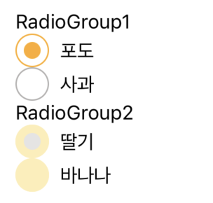
✨ 완성된 RadioButton
아래 사진을 보시면 디자인 시스템에 정의가 되어 있는 RadioButton과 동일한 UI가 구현되었습니다.
해당 예제를 위해 사용한 코드
import React, { useState } from 'react';
import Container from '../components/layout/Container';
import { Text } from 'react-native';
import RadioButtonGroup from '../components/ui/radio/RadioButtonGroup';

const Screen = () => {
  const [selected, setSelected] = useState('');
  const [selected2, setSelected2] = useState('');

  return (
    <Container style={{ margin: 20 }}>
      <Text>RadioGroup1</Text>
      <RadioButtonGroup
        selected={selected}
        onSelected={(value) => {
          setSelected(value);
        }}
      >
        <RadioButtonGroup.RadioButtonItem value='포도'>
          <Text>포도</Text>
        </RadioButtonGroup.RadioButtonItem>
        <RadioButtonGroup.RadioButtonItem value='사과'>
          <Text>사과</Text>
        </RadioButtonGroup.RadioButtonItem>
      </RadioButtonGroup>
      <Text>RadioGroup2</Text>
      <RadioButtonGroup
        selected={selected2}
        onSelected={(value) => {
          setSelected2(value);
        }}
      >
        <RadioButtonGroup.RadioButtonItem value='딸기' disabled>
          <Text>딸기</Text>
        </RadioButtonGroup.RadioButtonItem>
        <RadioButtonGroup.RadioButtonItem value='바나나' disabled>
          <Text>바나나</Text>
        </RadioButtonGroup.RadioButtonItem>
      </RadioButtonGroup>
    </Container>
  );
};

export default Screen;
이제 RaidoButton이 잘 작동하는지 확인해 보겠습니다.

해당 예제를 위해 사용한 코드
import React, { useState } from 'react';
import Container from '../components/layout/Container';
import { Text } from 'react-native';
import RadioButtonGroup from '../components/ui/radio/RadioButtonGroup';

const Screen = () => {
  const [selected, setSelected] = useState('');

  return (
    <Container style={{ margin: 20 }}>
      <Text>RadioGroup1</Text>
      <RadioButtonGroup
        selected={selected}
        onSelected={(value) => {
          setSelected(value);
        }}
      >
        <RadioButtonGroup.RadioButtonItem value='포도'>
          <Text>포도</Text>
        </RadioButtonGroup.RadioButtonItem>
        <RadioButtonGroup.RadioButtonItem value='사과'>
          <Text>사과</Text>
        </RadioButtonGroup.RadioButtonItem>
        <RadioButtonGroup.RadioButtonItem value='딸기'>
          <Text>딸기</Text>
        </RadioButtonGroup.RadioButtonItem>
        <RadioButtonGroup.RadioButtonItem value='바나나'>
          <Text>바나나</Text>
        </RadioButtonGroup.RadioButtonItem>
      </RadioButtonGroup>
    </Container>
  );
};

export default Screen;
이렇게 처음 의도한 대로 RadioButton이 잘 작동하는 것을 확인할 수 있었습니다.
만약 RadioButton이 여러 개가 된다면 반복문을 활용하는 것이 더 좋겠죠?
        {['포도', '사과', '딸기', '바나나'].map((v) => (
          <RadioButtonGroup.RadioButtonItem value={v}>
            <Text>{v}</Text>
          </RadioButtonGroup.RadioButtonItem>
        ))}
이런 식으로요
근데 여기서 또 질문이 있을 수 있습니다.

사용자에겐 포도, 사과, 딸기, 바나나 이런 식으로 한글로 보여야 하지만 선택 후 API에 값을 보낼 때는 백엔드 분과 약속한 고유의 key를 보내주기 약속하는 상황이 분명 있을 겁니다.
예시로 사과면 apple이라고 보내달라는 식으로 말이죠 이런 경우에는 이런 식으로 활용해 볼 수 있습니다.
      <RadioButtonGroup
        selected={selected}
        onSelected={(value) => {
          setSelected(value);
        }}
      >
        {[
          {
            label: '포도',
            key: 'grape',
          },
          {
            label: '사과',
            key: 'apple',
          },
          {
            label: '딸기',
            key: 'strawberry',
          },
          {
            label: '바나나',
            key: 'banana',
          },
        ].map((radio) => (
          <RadioButtonGroup.RadioButtonItem value={radio.key}>
            <Text>{radio.label}</Text>
          </RadioButtonGroup.RadioButtonItem>
        ))}
이런 것이 가능한 이유가
RadioButtonItem에서 Label과 Value를 개별적으로 관리하여 선택 표시 여부를 value로 관리하기 때문입니다.
활용법을 참고하셔서 상황에 맞게 적재적소 하게 활용하시면 좋을 것 같습니다.
😁 글 작성 후기
Checkbox에 이어 다른 분들이 많이 사용하게 될 RadioButton 구현 글을 작성해 봤습니다.
HTML에서는 RadioButton을 기본적으로 제공하고 있으나 React Native에서는 RadioButton을 제공하고 있지 않습니다.
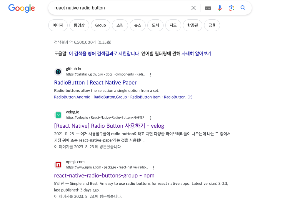
구글에 검색을 해봐도 이렇게 라이브러리가 나오고 있습니다. 가벼운 라이브러리들도 분명 존재하겠지만 단순하게 RadioButton 하나를 위해서 이것저것 지원하는 컴포넌트 라이브러리를 받는 것을 저는 개인적으로 사치라고 생각합니다.
그래서 저는 이렇게 직접 구현이라는 선택을 진행하게 됐었습니다.
사실 제가 진행한 방식이 맞는지? 항상 의문을 갖고 개발에 정답이란 없지만 좋지 않은 설계는 분명 존재하기에
제 설계가 잘못된 점은 없는지 항상 꼼꼼히 체크하여 글을 작성하곤 합니다.

그래도 분명 실수는 존재할 것이고 제가 더 좋은 방법을 놓쳤을 수도 심지어 알지도 못할 수도 있습니다.
그런 경우에 배움을 얻고자 이렇게 글을 작성하는 의도도 있습니다.
읽고 피드백해 주실 부분이 있다면 언제든지 환영입니다.
이 글이 React Native에서 RadioButton을 구현하고자 하시는 분들께 방향성을 잡아줄 수 있는 글이 된다면 좋겠네요
읽어주셔서 감사합니다.
'개발' 카테고리의 다른 글
| React Native Picker (4) | 2023.09.19 |
|---|---|
| useAsyncWithLoading custom hook (3) | 2023.09.12 |
| React Native useOverlay를 만들어 리팩토링 하기 이 글은 진짜 떠야 해 (1) | 2023.08.22 |
| React Native 채팅방 목록 구현하기 (0) | 2023.08.14 |
| React Native ToastMessage 구현하기 (3) | 2023.07.27 |